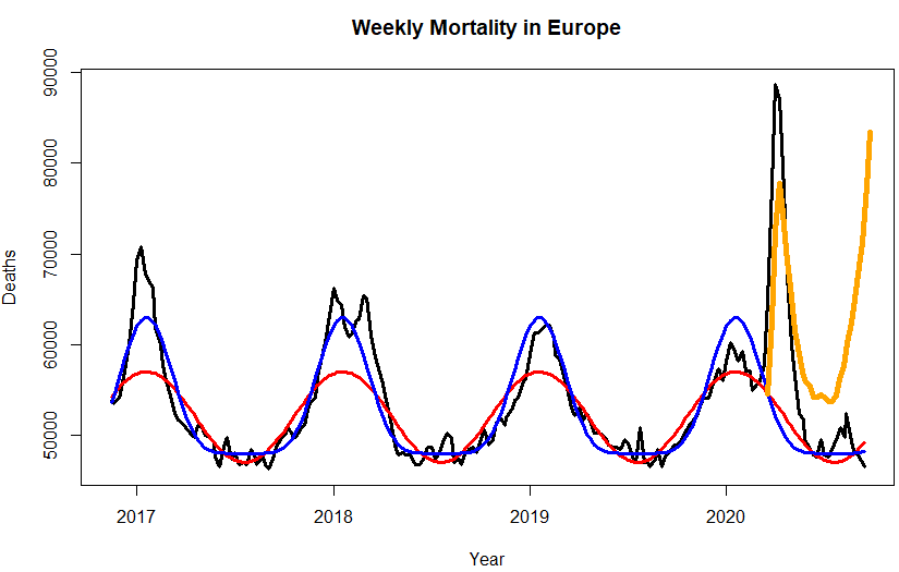
By now, excess mortality has been negative for over three months in Europe. Yet all governments, except the Swedish, deem it necessary to lock us up like chicken. This is the perfect incentive to have us buy a vaccine of 400 euro a piece.

Black: Raw Mortality
Red: [Poor] Euromomo Baseline
Blue: Improved Baseline
Orange: ECDC [Deliberatly Falsified] Positives
The black data points (weekly excess mortality) are taken from Euromomo, and the orange data points (weekly new corona cases) from ECDC.
Why Does Euromomo fail to Subtract Weekly Average Deaths From Weekly Deaths?
A basic requisite for a baseline is that its integral over a whole year equals the expectation over that year. Clearly, if Europe’s population followed Euromomo’s baseline, it would explode with rates that outperform even third-world countries. Even though seasonally adjusted, Euromomo’s mortality data structurally exceed the baseline during the winter season. A slight change of mathematics of the baseline equation (a cosine for Euromomo, the sixth power of that cosine in my proposal), do the job.
When statistical experts make elementary mistakes, something sinister is going on. As far as the ECDC data are concerned, they are even more worrying than the mortality data. It makes no sense at all that the Corona tests peak together with excess mortality. That can only be true if every affected person dies at the same day of being tested positively. Hence, a minimum requisite of sound testing data, is that they lead excess mortality by the average period between incubation and death, which is about three weeks.
Why Would ECDC Produce Fake Data?
That is hard to say. Ask the IPCC why they faked the hockey stick.
