
Israel’s President, Reuven Rivlin (standing), and the first vaccinator (seated) in Phase B of the vaccine, at the Israel Institute for Biological Research, BriLife at the Barzilai Medical Center. Are they two more innocent, ingenuous victims of the vaccination campaign, or are they on the payroll of Big Pharma?
Vaccination campaigns are poisoning campaigns. People are dying at an alarming rate.
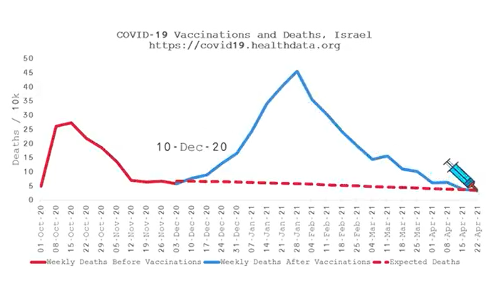
Excess Deaths in Israel. The Wikipedia site on Israel’s vaccination boasts: “Israel’s COVID-19 vaccination programme, officially named ‘Give a Shoulder’ (Hebrew: לתת כתף), began on 19 December 2020, and has been praised for its speed, having given twenty percent of the Israeli population the first dose of the vaccines’ two dose regimen in the span of three weeks. As of June 26th 2021 About 64% of eligible Israelis have received at least one dose (and a world-leading 60% with two doses), making Israel one of the populations with the highest vaccination rates in the world per capita. Coordinated vaccination drives by the country’s health authorities, utilizing databases of personal information for Israeli patients, contributed to Israel’s success in vaccinating a high proportion of its population in a short period of time, relative to the rest of the world.” Thanks to the completely irresponsible vaccination policy of so many countries, like Israel, the data now show the dramatic correlation between vaccination and excess mortality.
The above data apply to Israel. Analogous trends are observed for all countries in the world. Globally, higher vaccination rates correlate with higher excess mortality, as you can check for yourself on the IHME website (Institute for Health Metrics and Evaluation, Hans Rosling Center, Washington University, Seattle WA). Below, a talk given by Peter McCullough MD (Texas A&M College of Medicine) at Didier Raoult’s IHU Méditerranée-Infection (Marseille, France). At minute 20 second 05 of the video he says: “the vaccine is causing more deaths than the original problem” (the rest of the video is worth seeing, too). The second video presents the IHME national mortality curves over the past year. Joel Smalley, a data analyst with HART (a group of highly qualified UK doctors, scientists, economists, psychologists and other academic experts), took the data from the above-mentioned IHME site: the only two additions are the coloring of the continuous curves (blue from the start of the vaccination campaign onward, and red before), and the dashed red curve (expected mortality in the absence of vaccination, from the start of the vaccination campaign onward).
I am quite curious how the Rothschild mafia is going to counter these data.