
The graph below shows a clear trend: the richer the Country (horizontal axis) the higher the Covid-19 death toll (vertical axis). the color scale indicates the latitude of the Country: higher latitudes correlate positively with higher wealth.
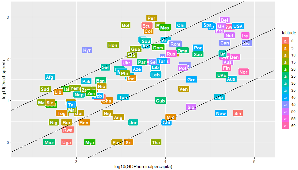
The vertical axis displays the logarithm of the number of registered Covid-19 deaths.
The horizontal axis displays the logarithm of the nominal GDP per capita (in US$).
Colors mark the absolute latitude of a country.
The Richer the Country, the Better its Hospitals
In order to check the soundness of such correlations, the graph below displays the correlation between hospital quality (a measure for wealth) and poisoning (an affectation that correlates with latitude only).
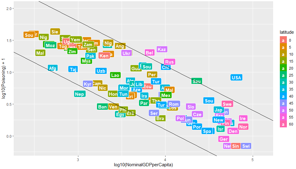
The vertical axis displays the logarithm of casualties due to poisoning (per million inhabitants).
The horizontal axis is as in the previous plot.
The second plot shows that the correlations reflect reality: wealthier countries offer better medical care. But why would wealthier countries register more Covid-19 casualties? This is certainly not due to the fact checkers’ ritornello that poor countries are unable to handle their statistics properly: the virusncov site offers sufficient proof to the contrary.
Do you wish to know what exactly is wrong and why? Fill Out the Contact Form and pray for an answer…
Data Taken From
https://www.worldometers.info/coronavirus/
https://www.worldlifeexpectancy.com/cause-of-death/poisonings/by-country/
https://en.wikipedia.org/wiki/List_of_national_capitals_by_latitude
https://en.wikipedia.org/wiki/List_of_countries_by_GDP_(nominal)_per_capita